Tuesday, April 23, 2013

Space Man, A Stand Up Comic


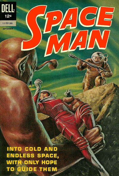
Another long-lost, early John Schoenherr illustration has come to light, thanks to the work log that I found a few weeks ago: it's the cover for issue #3 of the comic book Space Man, published by Dell in 1962.

It's job #225 in the log, which shows that Dell commissioned him on February 7, 1962, and paid him $200 on April 17. The original painting - wherever it is! - is most likely gouache on illustration board.

This one's closer to his usual fare than the Monster Parade covers, but it's still an oddball - at least compared to much of his other science fiction pictures. Its "retro" quality would make it at home on a pulp magazine or B-movie poster of the 1940s or 1950s. He sure could could lay it on thick, when need be.

Monday, April 8, 2013

John Schoenherr's Monster Parade


This an odd way to commemorate the third anniversary of my father's death, but maybe it'll leaven the gloom.

Last week, going through some paper bags and boxes of Dad's financial records, I found an interesting document: it's basically a log of his paid illustration jobs, numbered consecutively, starting with #1 in October 1956 (when he was a 21-year-old recent Pratt Institute graduate, living in his parents' house at 52-19 39th Avenue in Long Island City, Queens) and continuing all the way to job #258b in December 1962 (when he was 27, married, but still living under his parents' roof - or, rather, his father and step-mother's roof). I realized that I already had found part two of this "work log" that went up to job #324 in October 1964 (by which time he was married, had a 1-year-old daughter, and was living in rural New Jersey) as well as a few less-careful ledger pages itemizing his work through mid-1965.

Dad often didn't keep or get copies of the work he did, so the log - which notes the job number, the commission date, the publisher, publication, title or subject of illustration, type and quantity of picture(s), and fee (and sometimes the date he was paid and the date of publication) -  is bibliographically invaluable. By 1961 he was illustrating almost exclusively for Astounding Science Fiction (a.k.a. Analog) and doing paperback book covers for Ace and Pyramid. But before that he was drawing and painting for myriad now-forgotten publications, mostly science fiction-oriented, digest-sized pulp magazines and larger-format "men's magazines" full of lurid, sexy, and dangerous "true" stories with tag-lines like "I Gave My Legs to the Maggots of Africa"...

One of the houses he worked for was Royal Publications, starting with job #10 - two illustrations for the magazine Infinity - in December 1956. Over the next 15 months he did other things for Infinity as well as Royal's Science Fiction Adventures, Hot Rods, and True War. And then in May 1958 he was hired to do a cover for a magazine noted in the log as "MONSTER P." This - job #93 - was followed on July 31, 1958, by job #105, another cover.

It turns out that "MONSTER P." was short for Monster Parade, which lasted all of four issues. That makes identifying Dad's work a little easier, and I'm pretty confident that the two covers shown here are his work. The spider - featured on issue #2 for December 1958 - most likely came first, and then came the hula-hooping horror icons on issue #4 for March 1959.

A smoking gun by way of a credit or signature would help my case, but the texture of the spider and the handling of the bloody lady-in-distress feel right, and although Dad isn't particularly well-known for humorous subjects, he did in fact, do a lot of them, especially at that point in his career. So I'm planting a flag on these two illustrations on his behalf. Of course, if anyone can provide information to the contrary, please let me know.


Saturday, April 6, 2013

If You Can't Face It - Faint


A few years into my dad's illustration career, he began to do spots for a "men's magazine" called MEN. Here's one - probably painted early in 1960 - from a regular feature called "Men and Medicine" by Ken Armstrong.

City Under the Sea


Here's a paperback cover my dad was commissioned to do in December 1964 for Paul W. Fairman's City Under the Sea (Pyramid Publications, Inc., R-1162, April 1965). The novel wasn't connected to the City Under the Sea movie of 1965, but was a TV tie-in to the Voyage to the Bottom of the Sea series on ABC, which, in turn, was based on the 1961 Irwin Allen movie of the same name. Instead of coming up with his own submarine, Dad had to follow the movie/TV design of the Seaview.

Tuesday, May 8, 2012

Maurice Sendak on THE BARN


Maurice Sendak, who died today, met and corresponded with my father some 43 or 44 years ago. Only four of the letters and just one of the envelopes from Sendak have survived, and I’ve often wondered if Sendak saved anything Dad sent to him. I’m especially curious about his letters, but maybe his presentation copy of The Barn still sits somewhere on a shelf or in a box at the Sendak house.


It was the first book that Dad both wrote and illustrated and it was came out during their brief acquaintance. Dad’s author’s copies were en route from the publisher at the end of June 1968 and he must have mailed one to his fellow author-illustrator not long after. It took a while for Sendak to acknowledge it, though. He wrote in October or November:
You have had dreadful thoughts of me - no doubt! The Barn came weeks ago - & I haven’t been able to write. Please forgive me. The book is terrific & how marvelous that it is all you! That is as it should be. I think it has some of your finest drawings. Thank you so much.
He also - very candidly - explained the delay:
My summer was horrible. My mother, who was ill for two years, died at the end of August. It was ghastly. And my father came all to pieces. The last two months have been taken up with trying to keep him alive. He is in the hospital now - & has an operation coming next week. Of course I haven’t worked. Although - over the last two weeks I found myself wanting to draw again! Hopeful. I’m dreadfully sorry I couldn’t go up to the Bronx Zoo & see your pictures. I would have loved that. But, quite literally, my life hasn’t been my own - & there was no possibility. I hope I can see them - I really hope they all sold! but I’d like very much to see what you’re doing. When all is quiet & somewhat sane again - let’s make plans to meet.
I’m not sure if they ever met again, though they did make a plan the following March. Sendak’s subsequent letters, however, show that a sort of misunderstanding arose over their respective depictions of skunks (in The Barn and The Dangerous Year, illustrated by my father, and in A Kiss For Little Bear, illustrated by Sendak. More on that later). But despite their differences and strong opinions I think they had a real respect for each other’s work and, for better or worse, they weren’t afraid to speak their minds. I like how Sendak closes the letter I’ve quoted here:
I feel bad about not having written to you - I really do. But you will understand. Write when you can.

Yours,

Maurice


Sunday, September 25, 2011

Moon Crawler

Although I knew that some of Dad’s pictures inspired certain other things, I didn’t realize that one of his early science fiction covers seems to have inspired a toy or two. So I was happy to share some background information and sketches with the blogger who alerted me. Now, prepare for liftoff to Moonbase Central.

Thursday, June 23, 2011

Pulp Fiction: Trapped

Like many young illustrators of his generation, John Schoenherr did whatever hack work he could find after leaving art school. So, while his science fiction and natural history output gradually gained steam, dozens of his early pieces wound up in obscure, lurid “men’s magazines”. Often uncredited or pseudonymous, these pictures were typical of the genre: violent, bloody, and bosomy. Such as this cover from Trapped Detective Story Magazine for October 1959.

Feature Publications’ Trapped lasted for all of 34 issues. Its partner in crime was Guilty Detective Story Magazine and, according to Galactic Central, “Both determined to show that the spirit of the 1940s detective pulp magazines was still alive and well in the 1950s, albeit in a digest format.”

Schoenherr’s files for this phase of his career are far from complete, so there must be more illustrations out there, waiting to be identified. His reference photos might provide some clues, however: it’s just a matter of matching poses to magazine pictures. The following set, for example, was taken on March 19, 1959, for the Trapped cover.


Wednesday, June 22, 2011

One Day on Beetle Rock

I’m embarrassed to say that, until yesterday, I’d never before seen this paperback cover for Sally Carrighar’s One Day at Beetle Rock. Dad’s scanty records show that it was either commissioned or delivered on May 25, 1965, and that Pyramid Books paid him $300 for it. I assume the original is gouache on illustration board.

Friday, April 8, 2011

Rascal Ephemera

Here is an obscure piece of Rascal ephemera, which used Dad’s frontispiece illustration from the book. I think it was a promotional print, sent out by the publisher sometime in the late 1960s, as it came with a flier titled, “Honors for Sterling North’s RASCAL, Winner of the Dutton Animal Book Award, 1963.” It notes:
The fame of the Raccoon from Wisconsin has spread throughout the world to capture the hearts of young and old. RASCAL has been distributed by the Book-of-the-Month Club and by two other book clubs. It will soon be made into a Walt Disney film. A nationwide bestseller for six months, RASCAL numbers more than 115,000 copies in print.
It was also a flat-fee job that netted all of $1000 for Dad. But the “Raccoon from Wisconsin” helped put him on the children’s book map.

Jacket for The Golden Eagle

Dad’s jacket art for Robert Murphy’s The Golden Eagle, published by Dutton in 1965. I assume the original painting was gouache on illustration board.

From Incident at Hawk’s Hill

I keep looking and looking, but I just can’t find the reference photo that Dad used in making this illustration for Allan W. Eckert’s Incident at Hawk’s Hill. He and I posed for it - and that’s pretty much me (or a scrawnier version of me) and although the father’s head isn’t Dad’s, the strong forearms definitely are.


UPDATE of April 12, 2011!
I found the photo - it was hiding in plain sight. And, yes, Dad’s arms are much like the dad’s in the illustration. Also, I am indeed plumper than the boy in the book. If only I had been raised by a badger on the Manitoban prairies!

On the left in the background is Dad’s jacket illustration for “The Jezebel Wolf” by F. N. Monjo.

Thursday, January 6, 2011

Sherlock Holmes and John Schoenherr


Note: This post was significantly expanded on April 8, 2014

My father introduced me to Sherlock Holmes when I was 11. I’d already been watching the Basil Rathbone movies and drawing pictures of the character, so, technically, the introduction had been made years before, but it was then that ever-logical Dad suggested that I read the original stories so I'd know who Holmes and Watson really were.

Before long, I’d become an absolute fanatic and, besides collecting everything Sherlock Holmes-related I could get my hands on, I appropriated the original art for Dad’s sole Sherlockian illustration. He made it for Mack Reynolds’s science fiction story, “The Adventure of the Extraterrestrial,” which appeared in Analog magazine for July 1965. It was job #303 in his work-log, commissioned on March 29, 1964, and it was either one of the last jobs he did in his Long Island City studio, or one of the first ones his did in the small bedroom workspace in his new, old house in rural New Jersey. The ink-on-scratchboard drawing netted him $150.00. By the way, for copyright reasons, the aged Holmes seen in the picture was only referred to as “The Great Detective” in the text.

I always thought Dad’s Watson resembled his own father, though my Grandpa Schoenherr never had a walrus mustache like that (he did have his own copy of The Complete Sherlock Holmes, however). I remember, too, Dad pointing out that he’d deliberately updated Holmes’s unanswered-correspondence-tranfixing-jack-knife with a more modern switch-blade.

My father was definitely a Sherlock Holmes fan (though never a crazed one) and he attended scion society meetings with me before I could drive. He also enjoyed Arthur Conan Doyle’s Brigadier Gerard tales and it was a long-time wish of his to illustrate The Lost World - featuring Professor Challenger, who my father resembled somewhat. (Dad never got the chance - though this painting hints at what could have been - but, evidently, his one-time brother-in-law, Ray Sternbergh, painted the cover for the Pyramid Books edition of the novel.)

I should note that a few months before making this illustration, my father received the following letter from the Little Green Man Science Fiction Awards Society of Kansas City, Missouri.


Devoted Sherlockians will recognize one of the names on the letterhead. Here, too, is the April 1963 cover mentioned in the letter - and still more devoted Sherlockians should note that the author of the cover story, Winston P. Sanders, was the sometime-nom-de-plume of Poul Anderson.

Tuesday, December 21, 2010

“...And a red fox in a kangaroo’s pouch...”


A 1966 (or 1967?) Christmas card featuring a menagerie of animals from a few years’ worth of John Schoenherr’s children’s books. He made the original drawing in ink on scratchboard, but later scratched out the pine bough and ornaments (I’m not sure why).

eagle.........The Golden Eagle by Robert Murphy
kangaroo.........Kangaroo Red by Bernice Freschet
opossum.........Mississippi Possum by Miska Miles
fox.........Fox and the Fire by Miska Miles
skunk.........The Dangerous Year by Era Zistel
auk.........A Vanishing Thunder by Adrien Stoutenburg
rabbit.........Rabbit Garden by Miska Miles
bear.........Gentle Ben by Walt Morey

Tuesday, November 16, 2010

The Fox and the Hound and John Schoenherr

Most people know of The Fox and the Hound because of the cutesy Disney animated movie of 1981. But it was first a novel by Daniel P. Mannix, published by Dutton in 1967 and illustrated by John Schoenherr. I was scanning spreads from my copy of the book today and was struck by this one in particular.

Wednesday, September 22, 2010

“George Lucas Stole Chewbacca, But...”

I highly recommend this article about how Chewbacca came to be - and my father's role in that process. But what troubles me - and has troubled me and my family and many of my father's friends in the Science Fiction world since 1977 - is that he was the unwitting, uncredited, and uncompensated “collaborator” in this creative endeavor. And is that really okay?

Wednesday, August 25, 2010

The Illustrated Dune via SKI-FFY


The blog SKI-FFY posted scans of John Schoenherr's pictures for The Illustrated Dune. And he quotes the back cover copy...
"I can envision no more perfect visual representation of my Dune world than John Schoenherr's careful and accurate illustrations." - FRANK HERBERT
Hear, hear, Mr. Herbert!

As far as I know, Dad made the full-color paintings featured here for the 1978 Dune calendar, and then the publisher decided to use them in an illustrated paperback edition of the novel and asked Dad to flesh out the book with black and white illustrations. He made these using his dry brush technique where he would load a brush with india ink, wipe much of it off on a paper towel, then apply the brush to the rough textured watercolor paper. Once the basic composition was laid in, he would work out the finer details with a steel nib dip pen.

Sunday, August 8, 2010

Map of the Bronx Zoo

John Schoenherr (a.k.a. Dad) had a long association with the Bronx Zoo. He started visiting back in the 1940s and kept at it until he moved to New Jersey in 1964. In the late ’50s and early ’60s, my mother sometimes accompanied him to help provoke the animals while he gathered photographic reference of aggressive beasts - mostly for illustrations in “men’s magazines,” featuring vicious animals attacking Great White Hunters and other hapless, but rugged stereotypes.

Dad had his first one-man show at the zoo in 1968 and as a family we would visit sometimes: we especially liked the hyena, named Pug, who lived in the “Big Cat House,” which, in my memory, resembled the lobby of a neoclassical post office or bank with the cats and Pug as ersatz tellers.

Dad made this particular picture sometime in the early 1960s by scratching out the white lines and textures on black scratchboard - a rare variation on his usual method, where he applied ink where he wanted it on and then scratched away on white scratchboard.

Saturday, July 24, 2010

Uncalculated Risk

I ran the Queens Half-Marathon with my friend Charlie Nix today and this illustration pretty much sums up how it felt. The runners - or crawlers - even resemble us a little (I'm on the left and Charlie, as usual, is in the lead). Dad made this (while living on 39th Avenue in Queens, I might add) for Christopher Anvil's short story “Uncalculated Risk" in the March 1962 issue of Analog.

Wednesday, July 21, 2010

Big Cat, Little Study


Dad isn't very well known for his cat paintings, but he did a lot of them in the 1960s and at one point hoped to collect them in a book or a portfolio of prints. He even wrote a text to accompany the pictures, but the project never materialized.

This study of...a jaguar? (please correct me if I'm wrong)...is the same size, medium, and vintage as "Moonlight at Midday" below (i.e. gouache on illustration board, 4.375 x 7.5"). I don't think a more finished version was ever painted or published, unless it's in a lost issue of Reader's Digest - and since Dad did paint an entirely different jaguar for that magazine in 1969, maybe this was a rejected concept. It's nice, though - and the tree branches are so "him."

Monday, July 12, 2010

Moonlight at Midday


I've always liked this small gouache painting on bristol board, but it only just dawned on me that it could have been a study for one of Dad's many paperback covers. He labeled the back "Moonlight at Midday," so I searched for a book of that title and easily found Moonlight at Midday by Sally Carrighar, published by Pyramid in 1967. Dad didn't have a copy of the book, nor a proof of the cover in his files, so I'm happy to add something new to his bibliography.